Overview
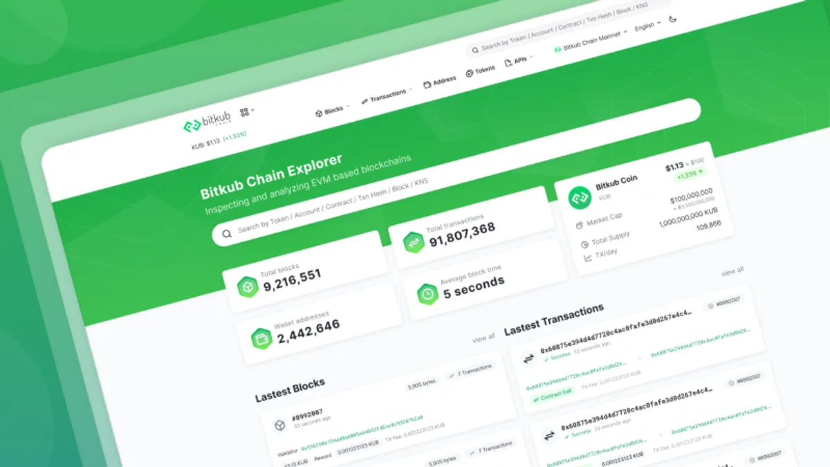
This project is a blockchain explorer. At first, the interface is a template that comes with an explorer engine called Blockscout. and we just change the color to match our corporate identity.
Because a starter interface is quite bad and this project is one of our core products, So I have a responsibility to revise the interface and adjust the layout of some pages to improve the experience.
The timeline of the project is quite short; it only took 5 days to design in parallel with the front-end developer.
Challenge
- Because this product is from the starter template, I don’t know the overall of the user interface, such as color and components.
- Some pages and sections are very technical, making them hard to understand. So I need help from the developer to explain.
- The timeline is short.
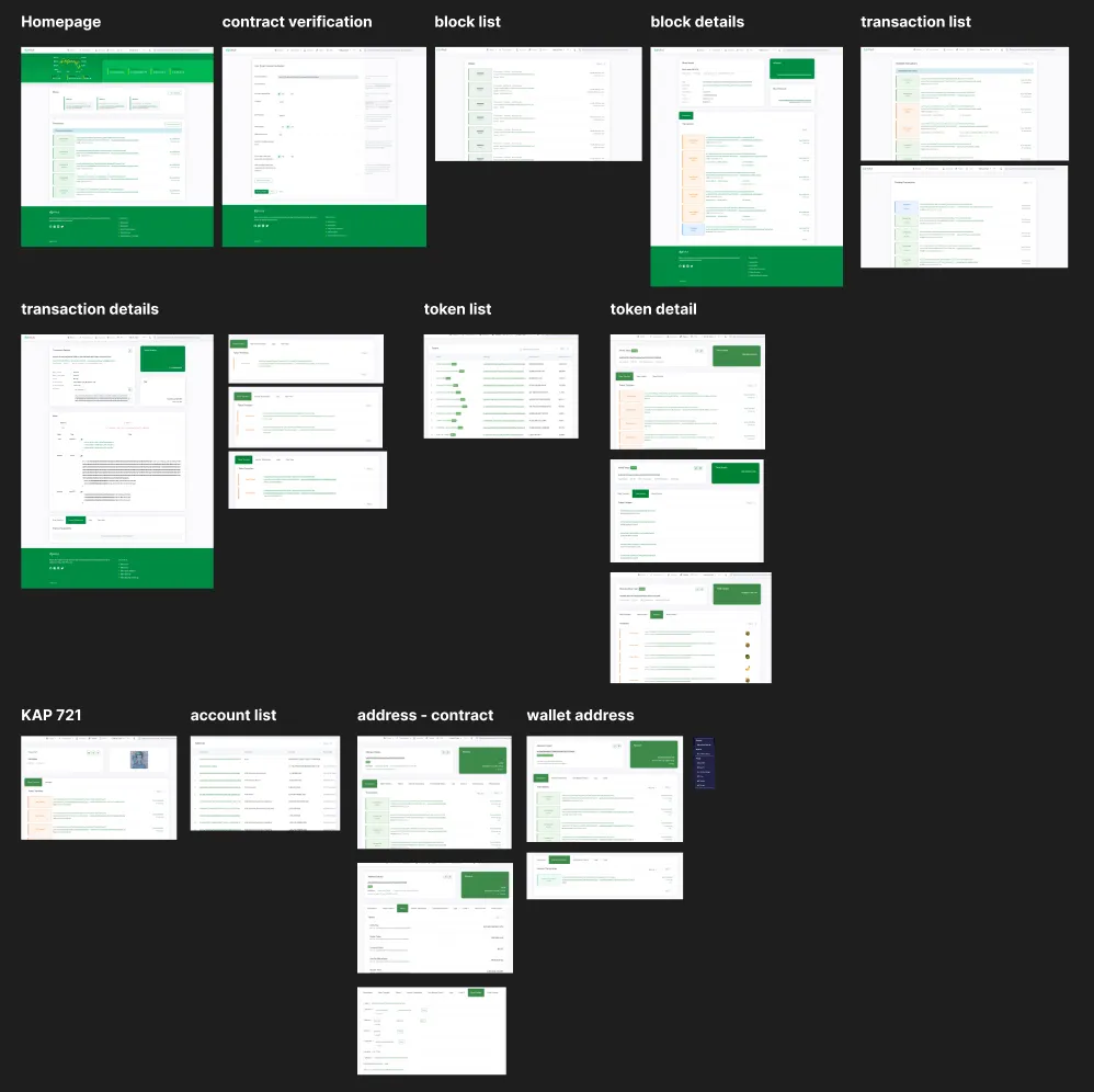
01 - Gathering the webpage
I started by exploring the product and capturing every page to know the overall scope of what I needed to redesign.
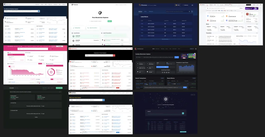
02 - Research
Next step I do is research other blockchain explorer to compare about layout which thing i will be can improve to make our product to better experience more than current version.
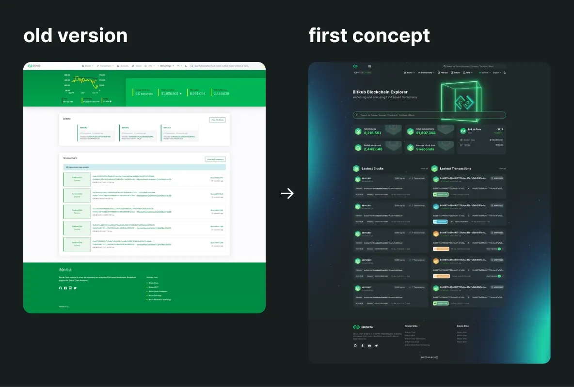
03 - UI concept
The reference UI from C-level is a product from a competitor, but it’s quite complex and colorful.
I chose two main pages of the product to roughly do a concept design about the look and feel and bring it to discuss with the team. And overall, we think it’s too fancy, and it should have a simple and minimal design. And I agree because I really want to do a simple and clean design too.
04 - UI concept round 2 !
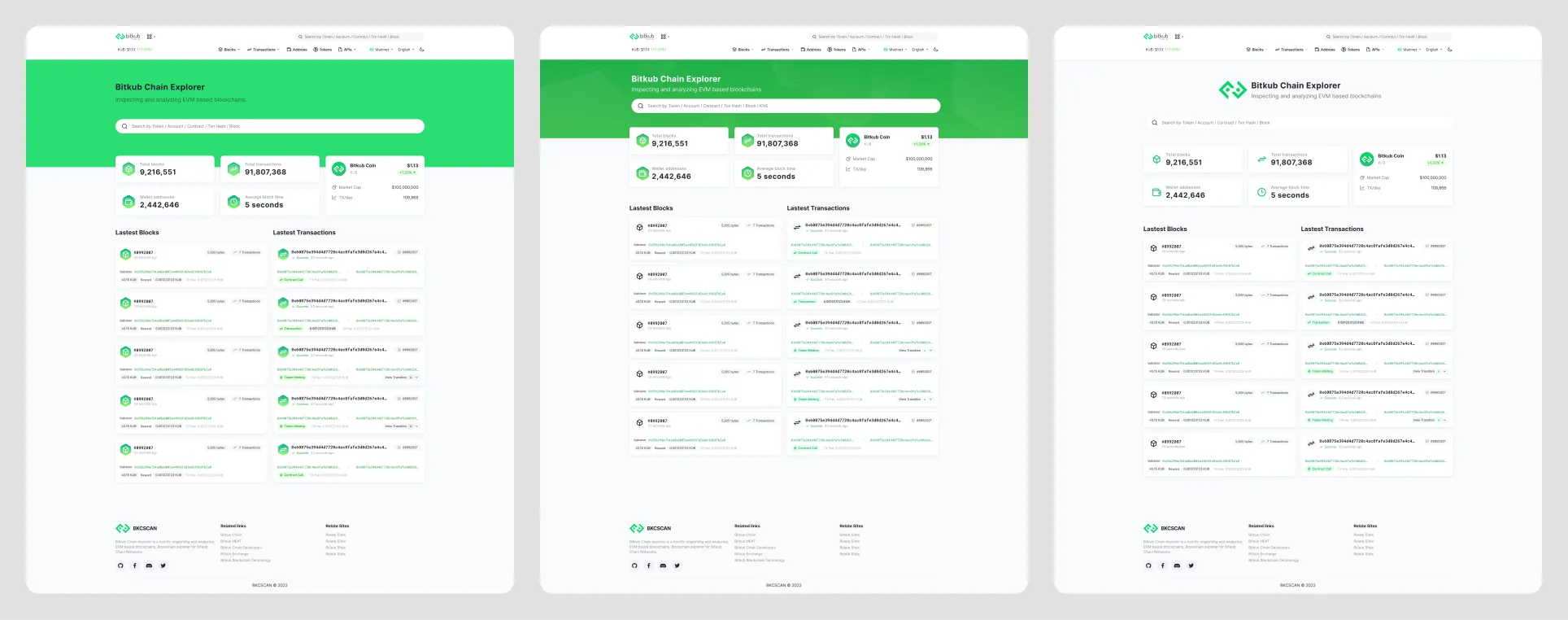
I redesign again, this time with a focus on minimalism. I created three versions to go over with the team. The first version is very colorful, the third version is very clean and minimal, and the secondary version is a combination of the first and third.
After consulting with the team and the C-level, we decide on a secondary version for redesigning the entire product.
05 - Finalize the design
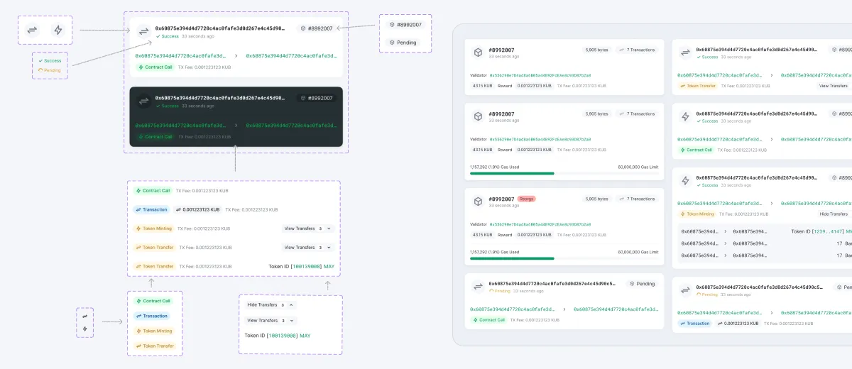
After I have a solid UI concept, I begin to create components and go over everything in detail. For a better user experience, the layout of some pages has been changed.
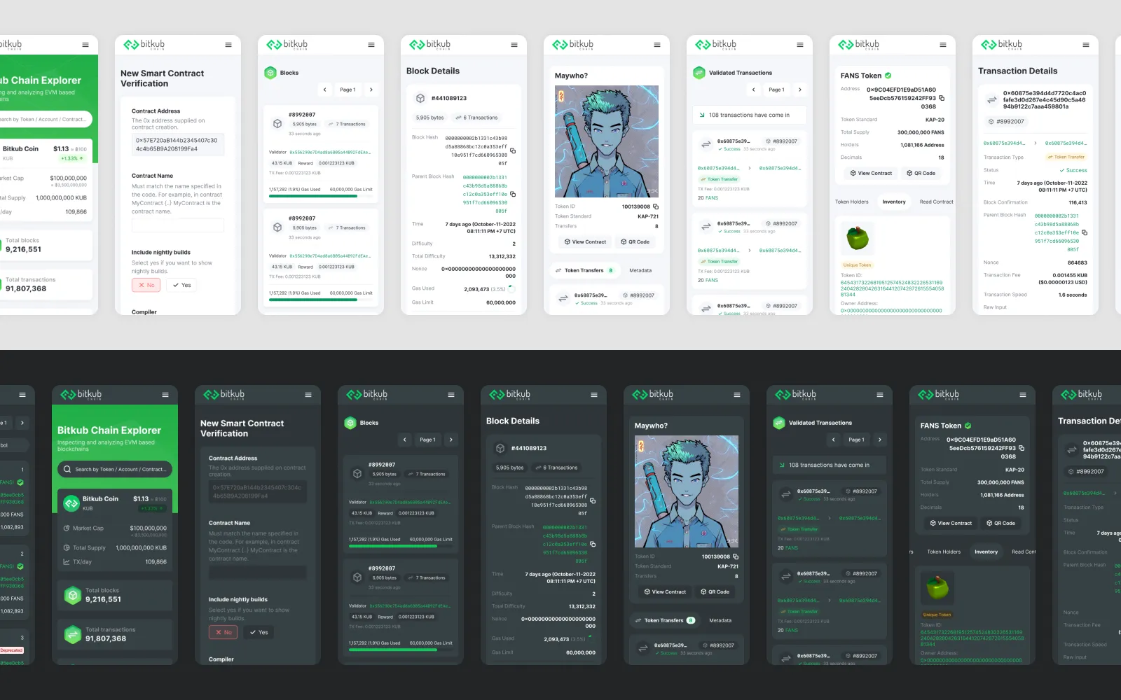
The result
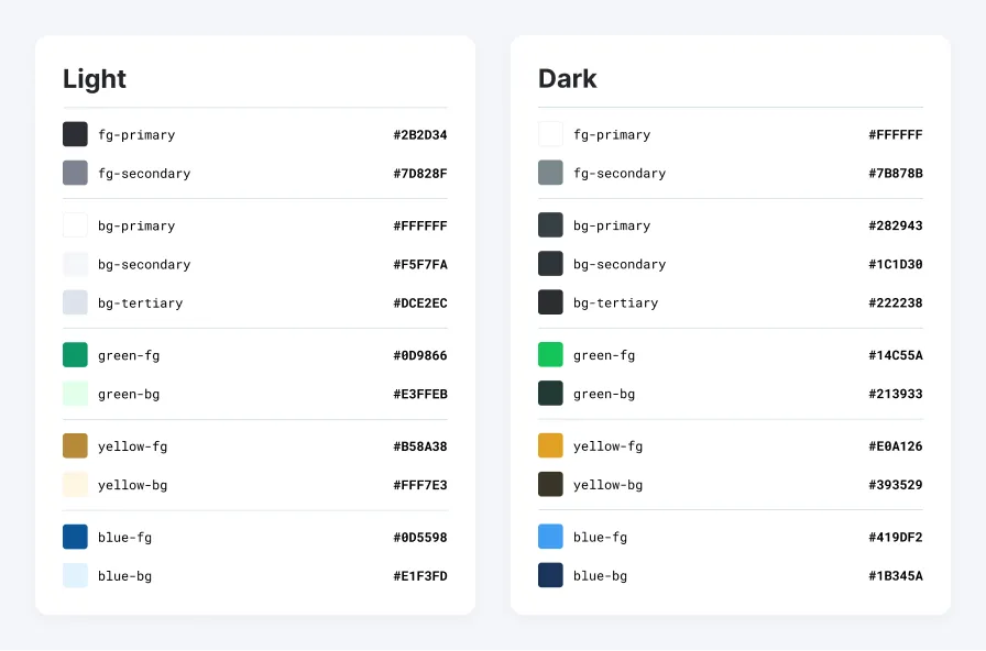
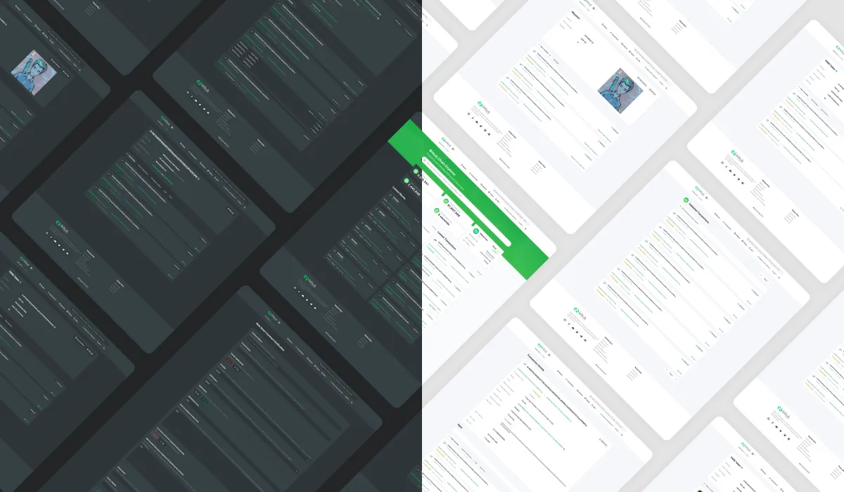
As a result, the product has a completely new redesign and dark mode, as well as a mobile and responsive design.
The new design is on production now you can visit this site https://www.bkcscan.com
What did I learn
I’ve discovered a lot about blockchain explorer. It’s also enjoyable to redesign the product. Also, we discovered a limitation of products that include templates: while we can solve the specific problem, there are some points that we cannot fix.